Gig Poster
Stickers are meant to be a self contained design, that may or may not relate to something. Slap it on a water bottle, a laptop, the back of a car or your grandmother's lamp in her family room. They're meant to convey a message in a small package. I wanted my stickers to be a collection that several different audiences would say "I want that" while having a fun color palette and be recognizable to almost everyone.
At first I was going to go with butterflies. I sketched a ton and didn't feel like any of them made sense, or really struck me as interesting. Then I thought of a rainy day collection with a girl wrapped in a blanket. I even digitized a few from the sketches I had made. But they were too blah to me. Nothing said "yesss, that's it!" So I moved on and started playing with conspiracy theories and cats. That was a fun concept but I didn't know how to realize my vision and so I had to set it on my "designs for a future date" shelf. Stay tuned for those some day. Honestly it was hard to pin down what exactly I wanted to do with this sticker set.
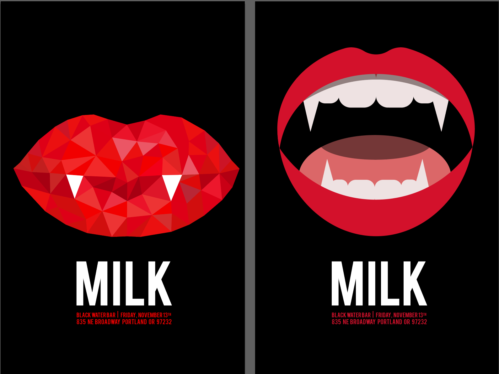
I wanted a diamond feel so I started with a closed mouth filled with a polygon design. It didn't feel menacing enough so I made an open mouthed version. I loved the polygon design but I also loved the open mouth so I took both and created a better version of it.
It was coming along and I really felt like I was conveying the beauty through the pseudo-diamond design and the open mouth but there were a few things I didn't like. The first was the mouth shape. I wanted a more open gape, to feel almost as if she were just about to close her mouth around your neck. The second was the name. I received a lot of feedback where the name changed the connotation of the whole design. Both needed an update.
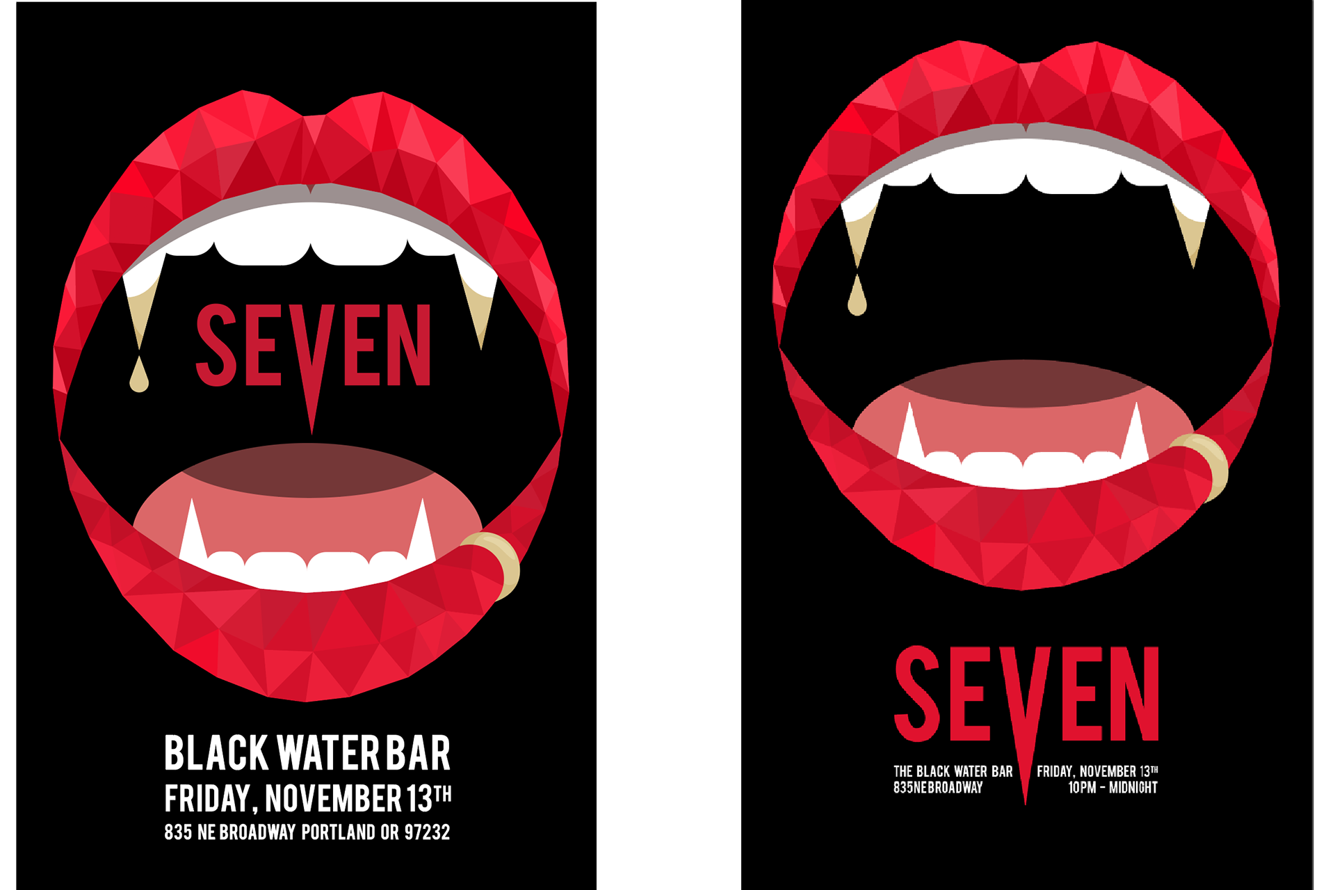
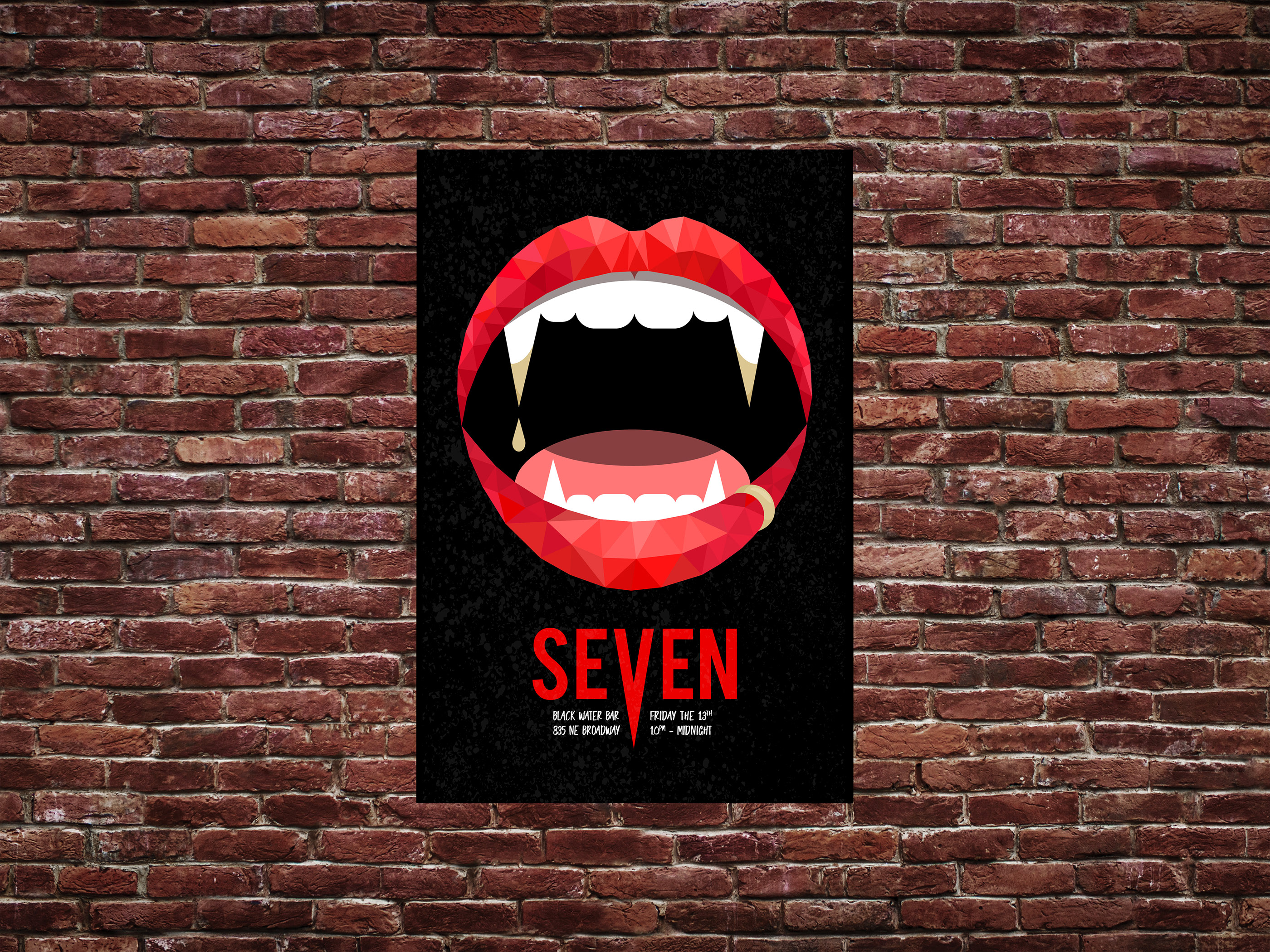
I changed the name to Seven and widened the mouth. Then I played with how open it was and the placement of the name. I felt like the right one had a better flow with the information and the band name in the mouth felt like a barrier between the viewer and the mouth. I drew the V down to echo the fangs. The gold was added to get the feeling of lust and to contrast it with what usually drips from fangs. It didn't feel quite right in the original sketches but fit nicely with the new design.
I added a lip ring to convey the idea of gold. I wasn't sure if the gold on the fangs would be obvious enough, but a gold colored ring that matched the gold on the fangs would hopefully connect that it was gold in both places.
I brought the fangs down to create a more dramatic point. I wanted them to say: "Warning, this mouth might be beautiful but it will kill you." The shades of the polygons became more specific to make the lips appear fuller and more ruby and diamond like. I added a very light texture to the words and changed the font to feel more scrawled. I didn't want too grunge of a feel, because it would detract from the simultaneous glamour feel.
The poster portrays how Seven's music makes you feel: are they sweet and sultry? Or will the murder me in my sleep? Maybe both? It has contrast in the color, the typography, and the idea of this creepy monster combined with jewels. I think it creates a great mix of both and really drives home "beautiful but terrible."